Search This Blog

Friday, 30 March 2012

Exercise: Identifying tools and materials (2)

While my scanner is out of action, I have taken a picture of the two things I have painted influenced by the style and techniques/materials used by Will Terry:

The first one is the most successful. I have chosen to change the point of view of the subject from the initial drawing, to bring the frame closer
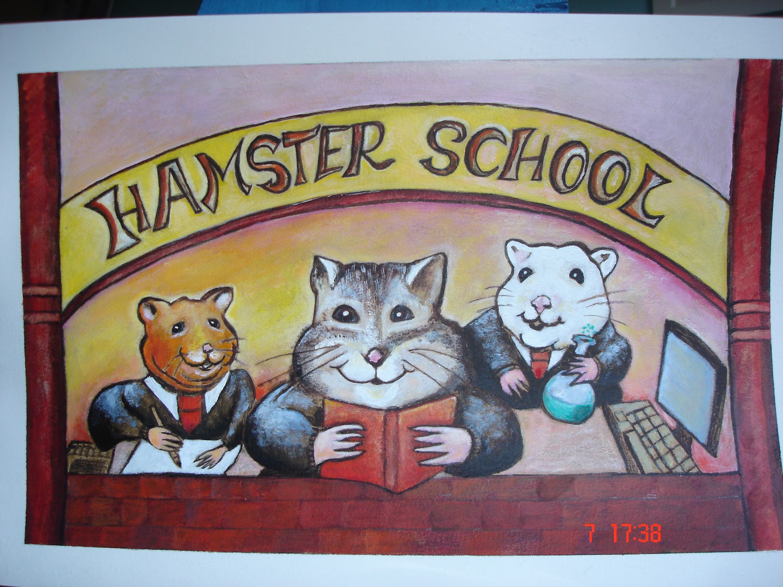
Painted in acrylics on paper


the original
These are the kind of colours I had planned to use

 I think it works well because the three characters are the focus, and like the three bears, they have different sizes.
I have tried to plan the writing so it is an integral part of the image, but I was still not sure about it. After asking other people their opinion, I am fairly satisfied that the lettering is ok, but many of them thought that the main hamster was a cat! I can see their point too, next time I'll have to remind myself to check not only the style and the viewpoint but also what I am drawing!!

For the next picture, I started with this image
I then decided to change the boy, to one that came from the Jazz poster. I also added sidekicks to add to the story:
At one point I realised that the picture wasn't working and I stopped painting.  I asked for advice about it from the illustrator Dave McAllister. He explained to me that I used too many elements of the same size (cats etc), and advised me to do it again. We also talked about the space in the image that I have 'filled' with creatures and flowers... and compared it to the style of Will Terry.  Will Terry keeps it interesting by suggesting clouds, vegetation etc and in his images that inspired me,  he uses the composition so there is little space like this
.
At this point, I have left it and may come back to try again later.  

Saturday, 25 February 2012

Exercise: Identifying tools and materials

Since I've found using acrylics rather fun and practical in the previous task, I decided to find illustrators using this medium. 
  Here are the ones I have selected at the moment (maybe others will be added later):


The Brothers Hildebrandt painted large Lord of the rings illustrations in acrylics on masonite

Will Terry: uses acrylics on arches paper, and also digital art.


Zachariah Ohora works with acrylics on stonehenge paper


Jun Hua 'bugs' life' is also colorful but different in style

Looking at the work of the Brothers Hildebrandt, I have found that to illustrate a calendar of 'Lord of the rings', they created very elaborate initial drawings on tracing paper before these were transferred onto large pieces of masonite, then painted in acrylics. Apart from that, I haven't found more details about the tools and materials they used. 

Will Terry has his own website where I purchased his short course on painting with acrylics (dry brushing).  For his acrylic paintings, he gives detailed information on the brushes he uses (mostly flats) painting medium, paper and technique. He also uses detailed drawing before putting brush to paper following a whole process that is followed every time. The initial drawings and some decisions about the composition (eg where the lighting will come from) are part of this process. Interestingly he talks about changing the process to digital and the advantage of being faster.  

Zachariah Ohora produces images including the lettering. On his website, I have seen that he has been working with silk printing for a bus illustration. I can see that his work with expenses of a limited colour palette could be made with painting or printing or digitally. Unfortunately, as I have often found, illustrators work is often shown as images, the artist can be in the spotlight too but - unlike when I researched pen and ink illustrators - there is virtually no information available on tools and materials. 


Monday, 6 February 2012

Assignment three: A poster

The Brief: to design an illustration for a poster for a music event - I picked "a Jazz evening".

1. The moodboard: as usual, I found it very difficult to make one. I spent some time on the computer looking at some of my favourite posters - for a jazz festival in New Orleans, and others. I printed small images of those I liked best. In the end I decided what they had in common was mostly bright colours.

Ney Orleans Jazz & Heritage festival

Ivy Hayes

Milton (album cover)

Another influence:
Nótt, the personification of night in Norse mythology, rides her horse in this 19th century painting by Peter Nicolai Arbo.

This led to sketches of jazz players and ideas about making a poster with cherubs (I posted these in an earlier post by mistake).

I have learnt that I am not good enough to use the computer to cut and paste images. Putting it all together was done with tracing paper. I liked moving the figures around on bits of tracing paper until I was happy with the scene.  The function of my printer that can reduce or enlarge like a photocopier was also useful. 
However to decide on the final images, I had scanned my drawing and turned it in slightly different visuals.


Jazz 1
jazz 2


At this stage, I prefer "Jazz 1" as an image, but I'm not sure where the text will go.  Having no experience of making posters, I looked at the kind of thing people write on theirs:

Jazz Funk
FRIDAY 9th APRIL
8 TIL LATE
THE SANDPIT CLUB, OHIE...
TEL 669 741859


JAZZ
At the
Spotted Dog
Every
       Tuesday
                8:30 pm
Alcester St Digbeth B120NH
Drinks discounts for students
       and musicians.
Hot food Available for £1:50             etc.

Here is my poster.  I have used the computer to add text as I think it may be done, this is only to give an idea of what it could be like.  


The original painting has been made with acrylics, which I am just starting with. I still experience technical problems just to apply the paint smoothly!  I also added pencil and graphite. Unfortunately, the graphite doesn't scan well and some of the shading does not show.

It is worth noting that for the first time, I am proud of the result, despite all its little problems!


SKETCHBOOK EXTRACTS


Monday, 9 January 2012

Exercise: Making a mock-up

For this exercise, I was to mock-up a book cover. The title was 
'' The old man and the sea'' by Ernest Hemingway.
  I chose it because I read it last a long time ago, but I remember how the story evoked in me strong images.  I ordered a new copy (in English this time!) and read it again.  There have been many printed versions of this story, and many different covers. Here is a selection:


made into a film


For my own version of the book cover, I realised that there were many things about this story that could inspire a cover:  the characters: the old cuban fisherman, the fish (a marlin), the boy,  flying fishes and sharks.
Themes: Ageing, fishing, life of fishermen, the sea, dreams...   too many to bring coherence to a picture!
I selected the man fishing from his skiff and the fish.  
I also picked lino printing for this project. I grew up with some wood cut prints that my father had brought back from Brazil.  At that time (late fifties, early sixties - like the book) wood cut printing was used a lot other there, especially as the technique was used for political propaganda flyers (images of people at work etc). I wanted to experiment with the technique and thought this was just the right time for it. So I bought the beginners' tools of the trade, and with a few plasters on my fingers, managed to produce small images from all the sketches I made.

I have used a new computer programme (for me) called pixlr, and some of my images together and here is my mock-up. I have put the text as best as I can to give an idea of what it could be like... 

Thursday, 15 December 2011

Project: creating mock-ups

For this project, I realised that I failed to find a magazine or newspaper with a design I like. This is probably an indication that this field is not for me??

In any case, I picked an article in the New Scientist, entitled Crocodiles swam the Atlantic to reach America.  I Practised doing this in the middle of Christmas preparations, so for instance instead of looking for a fine nib and ink, I used a felt tip pen. I chose to do something rather than being stopped in my tracks by perfectionism.

My mock-up was made by measuring the space where the picture is with the crocodile, scaling it up to make it easier to draw, and fixing it together as best as I could with the computer. Not sure where the pixellation came from but I like it! It's a bit like computer style impressionism!  

It worked saved in "Gif"


Note to myself: used crocodile sketches, scanned them and printed them in different sizes. Printed-cut and glued them, then painted over it. Looking to have a lino cut (/wood block print) feel. (Not sure that in this image the statue croc. is the right size). Afterwards, looked again at the 'tears of the giraffe' book cover, and realised that there is an area around each object, like the paper cut around the design, sometimes coloured, on each and every object.