Search This Blog

Showing posts with label Part five: words and pictures. Show all posts

Sunday, 7 July 2013

Working for children


I was working on a brief "working for children". I had to pick two animals and make images for two different age groups. 

I started with a wolf. Sketches first, then I made a self-portrait in acrylics with a composition that was meant to be about the grown up little red riding hood, and could be a book cover for a teenage audience.
some wolves in my sketchbook
I made lots of sketches of frogs towards 'working for children'.  Here is a selection

This is in my 6th A5 Sketchbook, I recently was inspired by the blog of the Illustrator: Kristi Anne Wakelin and started working on a A3 sketchbook, I feel grown up now!

a page from my A3 sketchbook
Here is my image based on my sketches, for a wrestling frog. This is in a style aimed at small children still learning to read. For that reason, I chose a large square format and lots of little things going on around the main character.


I had started with another idea for a frog: a frog on a bike, but I thought that to do the bike to a decent standard it would take me more time than I wanted to spend. Also, when I started researching frogs, my favourite was the mountain chicken frogs. It is BIG and I quite like the idea of a frog different from Kermit or others with tiny arms and legs, a muscular frog!


Goodbye frog on a bike!


At the same time, I was working in my sketchbook on another image. This is an interesting mish mash of my trying to carry on looking for images I like including letters, my sad little bear character who appeared in a previous project, and trying to progress with my pen and ink technique. I'm sure my technique can still improve but in my opinion this has been successful. 


Sunday, 30 June 2013

Assignment five: Seven days

First ideas were based on the days of the weeks in songs on you tube, but didn't find them very inspiring. Another idea was to make small illustrations for a magazine, about the days of the week on the 5:2 diet. I started sketching ideas with a pig character.

 Reflecting on this, I thought I preferred making illustrations for children.

The Brief: the title is Seven days.
I chose to design illustrations that would be used online or in a brochure to schools, as a teaching aid.  The illustrations would be about the days of the week, and show nursery rhymes associated with the first sound of the day of the week.  For instance the sound "m" of 'Monday' would be associated with 'Mary had a little lamb', or 'Mary, Mary, quite contrary'.
The illustrations could be used for printing in a book, after consulting with a sample of schools.  I also thought of making it possible for the designs to be used for making cross stitch, but since I have started working on this assignment, I haven't had the possibility to consult friends who do cross stitch and check if this is at all possible.
Here are my roughs:
Sunday

Saturday
Tuesday

Wednesday
Thursday.  The raindrops added in pencil, haven't scanned!

Friday 
Monday
The images I worked on were square. After uploading my pictures I have noticed that the quality has gone down and that they have been slightly changed, this is due to my scanner. There is also a large white margin around each picture.


This is an example of the design for Monday, 'Mary, Mary, quite contrary', painted in colours (gouache).

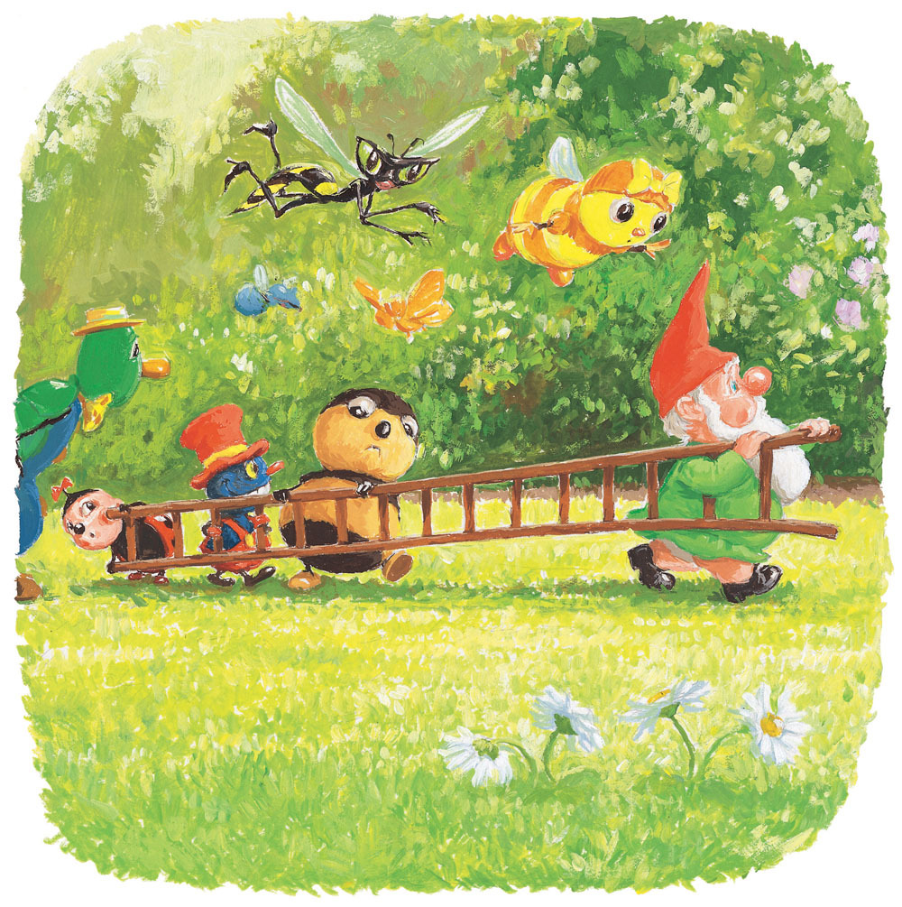
I was inspired by the children books of  Antoon Krings with their bright colorful illustrations and painterly style.
Antoon Krings
Sketchbook:

Monday, 11 March 2013

Exercise: Working for children

Collect examples of imagery for children for different age groups:
     I followed the age-guide as it was on websites (some have cross-overs, like "the very hungry caterpillar"). From my experience as a mother and as a teacher trainee, I know that these are far from clear-cut and rather individual.

     I have found some books and toys are clearly targeted with sex discrimination - from the age of 6 (i.e. fairies and pirates). This reflects on the colours used in all merchandise available for kids, and remains except for toys which can be sold to girls and boys. Roald Dahl books are a notable exception in my view.
     In books, the look of covers becomes more and more like those for adults as the targeted market ages. Similarly, the names of illustrators are clearly displayed for younger readers and seem to disappear towards young adults.

Pre-reader books
black and white imagery is supposed to help babies

Early reader (5-7)
Established readers (7-9) 

Older age groups:

Wednesday, 27 February 2013

Exercise: Packaging

Technical problems of the day: today my computer won't accept to load pictures, and the scanner which is still not talking much to the computer, has changed some of the colours of my Dinosaur biscuits packagaging quite a lot. Nevertheless I tried to give an idea of what they would look like with the name of the flavour added by computer, as I had planned.


Packaging I like


Tuesday, 18 December 2012

Exercise: travel guides

The brief is to produce three illustrations for a series of book jackets, travel guide sized, for Helsinki, Istanbul and Milan.

This is not my cup of tea! I try to be positive and try, in the past I have always learnt a lot from projects that I would have avoided.  First I searched the internet. I did look in the library where Turkey barely exists unlike New Zealand and Australia! - not to mention there is nothing at all on Finland...  so the internet is great for me. I was looking for images of "things not to miss in ..." and maps. Maps are not great. In Istanbul, there are so many things to see, very close to each other on a map that my first thoughts for a diagrammatic way to put it all together were out straight away - or are they?

http://neuroself.com/2011/05/14/human-brain-mapping/


I found something that summs up my idea of 'diagrammatic', that could be useful here (?)

http://www.austinkleon.com/2008/02/13/in-defense-of-food-an-eaters-manifesto-by-michael-pollan/


I decided then to look at what the three cities would have in common that I could show visually. Two of them are by the see, one is landlocked. I therefore concluded that the style of the covers would have to unify the guides, with an idea of a map to add the required diagrammatic element, and featuring one perhaps two images showing a place of interest. I also almost always take too much time on each project, so for myself, I wanted to do this as quickly as possible.

Helsinki mood board, I'm so proud I can do this now, so easy for someone else maybe!
In the middle of the project I realised there was a quick way of putting together a mood board that I could use on pixlr. Helsinki has its own visual problems: the Sibellius monument/sculpture looks interesting and I would love to visit it, but visually from a distance I don't like it at all. The rock church is 90% underground and very big so it looks like 'a pile of rocks' from the outside, and small pictures really don't make it justice.  I think I can use better a picture like the one of a summer house (very popular things in Helsinki ) with northern lights.  Note to myself: I copied the medieval image found on the net when I was researching helsinki, but can't remember where it came from!

Coming back to this project: I had various ideas started and abandoned. Here is one of them which is more developed:


Tuesday, 11 December 2012

Editorial Illustration II

Imagine I have been commissioned by the paper to create an illustration, being a visual interpretation of
How green is your food?
I immediately thought of food that comes from the other end of the world using planes etc. and the associated air pollution.  I did find an online article that supported that idea:
http://news.bbc.co.uk/1/hi/uk/4684693.stm
However, my visual ideas came to me before I found the article, I made notes such as 'veg on a plane' or 'veg driving'. I thought I could use some recognisable vegetables as metaphors. I looked on the net for images of vehicles and made some sketches:


I liked this idea of the motorbike, and decided to work on the idea of a chicken as a hell's angel on a Harley Davidson and got straight into it. My veg (peas or beans) had arms added to make the image work, but my family criticised them and said they could be all sort of things rather than veg. My idea of a Harley rider facing the viewer, would work better with a chicken as it had 'arms and legs' already there.