Search This Blog
Friday 26 November 2010
26.11.2010
This week I have been working on a 'mood board' on the subject of 'childhood'. I was not sure of the size the 'board' should be and asked my tutor by e-mail. Unfortunately I received her reply after I did it. I reflect on the fact that I have paid for a distance learning course. It was very expensive for me, and I tried my best to make an informed choice before deciding. Someone I trust also told me they had a positive experience with the OCA. Nevertheless, it is distance learning - relying on the internet at the moment - and when my tutor is sick, as she has been for the past two weeks or so, I am left to my own device. Worse than that, this is my first course with this organisation.
Their website is not good for illustration students - in my opinion - it has 'doors' for many other courses, but not for us. As a result, every time I tried to communicate through there, the answers were from other students, not very quick to reply either. It probably does not attract many students, some of them told me that they had formed another forum which they found easier to use. I am not surprised. Either dieting websites have better chatrooms!
So at the moment I feel very much like I am left on my own with my folder with the course work (a very expensive folder). I am a person who needs lots of encouragement, and could get really disappointed. Luckily I still attend a weekly painting class, and my teacher there is a commercial artist. He is interested in what I am doing and is always full of advice and suggestions. On the positive side, I am learning some new things and I do appreciate the contents of my folder. It pushes me in new directions, and since I have paid, I make sure that I do do it! I didn't particularly enjoy this week's exercise but I gave it my best shot.
I started by following the instructions (although I thought A3 was a large size of paper to work on and later my tutor told me it may be too small), collected images which related to my childhood, all of them symbolic. But I did not like the visual aspect of the finished product, and so I worked on it with pastels - and went a bit too far, but there is no way I'm going to do this again!
I also made random sketches, not as many as I would have liked but it's important that I've kept sketching. Some are for a thank you/xmas card for a friend who works at the Tate gallery. She has given me 2 free tickets for the Gauguin exhibition! Plan to go with my daughter. It's particularly welcome as I have only seen one local exhibition lately, about african textiles. I was looking forward to it and it really did not live up to my expectations. There are certainly more colours and different examples in the shop windows around here!Let's hope next week is going to be happier!
Friday 19 November 2010
Developing a visual memory
I was keen to practise 'cataloguing the contents of (...) through drawings'. So after going for a haircut, I drew what I could see on the hairdresser shelf in front of the mirror, on the way home, on the bus in a tiny sketchbook.
It was very informative (tiny drawing that I can't find now). I remembered a brush, the top of which I could describe in details, a small spray bottle, after quite a while I remembered a comb that was put down and picked up by the hairdresser, and the rest was a big question mark.
I think I had been sitting there for about 20mn, looking at the hairbrush and day dreaming. Not taking any notice of anything else. Since then, I have started looking around me more accurately, as if I was opening my eyes. Perhaps I should update my eye test too?
This week I haven't sketched as much as I should, I finished the 'childhood' small painting in oils that I mentioned earlier:
It was a pleasure to paint, and mess around with the paint texture. I thought that the bike looked fine to me, but I had struggled with our position, proportions, faces - still difficult to paint a child and not ending with her looking old!
Also, there was a discussion on the OCA website about art where I said that I had to come to the conclusion that at least part of it is genetic. Two generations ago my family was working class, doing their best to elevate themselves above poverty. In this situation, art was allowed as a hobby (music, crafts) if accepted at all, despite the fact that many had displayed artistic abilities. I am very lucky to be able to feel that I can be an artist. I have been a musician, a potter, and now an illustration student. Still, it is not comfortable, the guilt is about not having 'a real job' and not bringing in money for the family.
Turning words into pictures:
I have started this exercise, but despite having a range of materials at hand, my ideas seemed to come too quickly and I captured them in pencil, then I checked with Google images to find some more. I have chosen the word Exotic. Google reminded me of 'exotic cars', that I am not interested in at all, and 'exotic dancing'. That one seems to be about strippers, belly dancers, burlesque. I decided to pick Josephine baker to symbolise exotic dancing. Somehow this has led me to start a portrait of her in the style of a 'Fayum mummy portrait' (more about this later), in oils. Here are the images I was talking about:
Also remembered one of my favourite painters: Le Douanier Rousseau
 |
| Henri Rousseau (dit le Douanier Rousseau), Le Rêve, 1910 Museum of Modern Art (MoMA), New York |
Friday 12 November 2010
12/11/2010
Generating Ideas:
Exploring Lateral thinking, Brainstorming and
Spider Diagrams
A Google picture search of 'seaside' gave mostly pictures of 'beach', 'sunsets', 'shells', 'weddings on the beach'- which I forgot - all of them, and some illustrations. For instance prints by Natalie Pascoe, and saucy postcards (I love these!). OK, so this search has shown me that it may help not to forget a major concept.
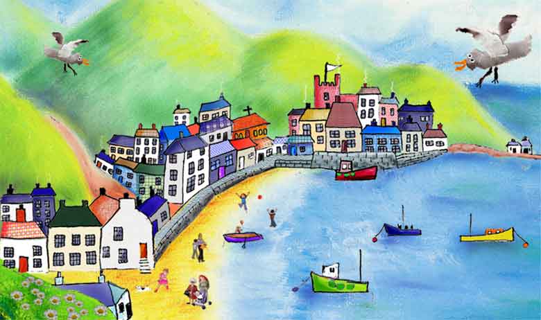 |
| Natalie Pascoe (Print) |

I repeated the process with other words, and checking my diagrams against what came up when my daughter tried to do the same thing, I realised that this way is another one to bring up new ideas.


In my case, the word that was more difficult to work with was 'Festival', and my diagram reflects it. It is much smaller than the others. This is simply because my experience of festivals is limited.Or so I thought until I used the Google picture search. Again, it reminded me that I forgot street festivals, such as carnivals, and I've been involved with Mahogany, a big local award winning carnival company (I didn't realise this could fall under the 'festival banner').
My favourite strategy to generate ideas was to think about the subject myself first. I like it because it is more personal, and rooted in my experience. The use of a search engine is easy and quick, (as long as a connected computer is available), and reminded me of important things that I forgot, so I should use it too. Asking someone else is also useful, but it depends on the availability of another person, and who the other person is, while my computer is usually available on demand . On the other hand, the computer comes up with ideas that are less personal and I'd have to be careful not to forget that they can be too commonplace.
Wednesday 10 November 2010
Exercise: writing a brief
After reading the course information, I have found an illustration in a newspaper, but I was still curious and looked at examples of briefs on the internet.
Illustration Brief:
Clients: npower
Overview: npower is a gas and electriciy supplier.
They now want to increase their own brand profile and supply of green energy with a seasonal promotion in newspaper.
Usage: The illustration would be used and incorporated in an advert with the company name and required information, placed in The Guardian on Monday, 8th November, 2010.
The illustration needs to appear below an area for a banner with text and a Christmas style border, and above promotion and company's details and information.
The ad size is 22 x 14 cm(portrait format). Illustration: 15x14cm.
The look that they want to achieve is one similar to a children book illustration/cartoon. The Illustration will extend the meaning of the text (key words: get smart, winter, green energy). The client would like something more than a static illustration, so some quirkiness, movement or witty element may be preferebable to make the illustration more striking and memorable.
The finished advert will be in printed in black and white.
Monday 8 November 2010
'greetings'
School holidays (including Haloween) means that I have taken a break for a week.
This week I came back to my 'greetings' postcard project, with no ideas at all. At first I was so frustrated that I started feeling like a clown. Hence my first sketch:
This gave me a starting point for another sketch, describing my working conditions on the kitchen table etc:
I was supposed to be 'in the style of' Quentin Blake. I liked it as a starting point and moved on to more ideas:
To get to this point, I had cut and pasted the paper (didn't know how to do this on the computer), and realised that the image of my son (with the axe) in his halloween costume reminded me of the boy in 'Where the wild things are'
I tried to 'adopt and adapt' some elements
like the trees, so they would be obvious
clues for people who know these books.
I tried to add shading with pencil marks
that would emulate his pen style, not sure
this was entirely successful.
So here is my finished picture. It was made by printing the previous image in progress on art paper, then using gouache, pencils, and a pen (felt tip kind made for pen and ink).I made my image bigger than a postcard for putting in details more easily (25 x 17cm).

I'm having so many problems with this technology, I am wasting so much time with my beginner's mistakes! Here I was trying to show my finished image, plus the fact that although I can now control the size of the image in print, on paper - when it comes to what goes on the screen, how to place it, and make it in the same proportions as the original, it's the system controlling me rather than the other way at the moment. So this image should be 16.5 x 11.5 cm. I have show two here. The first one is scanned and added here. The second has been resized with photoshop elements first, and I have asked the computer to show it at that size, but look what I get (added as 'original size'). I have left it as an example of my continuing learning and battling.
A last image I want to put here this week, is an image in progress. Painted in acrylics, but I will continue in oils. It represents practice and more. I was working on resemblance. I am painting from a family picture. The one in the back is me, and this picture captures a long, long story which means a lot to me. I didn't realise how much until I started. I think I ought to dig deep and see if I can use whatever lurks in there for my own development. Here it is:
This week I came back to my 'greetings' postcard project, with no ideas at all. At first I was so frustrated that I started feeling like a clown. Hence my first sketch:
This gave me a starting point for another sketch, describing my working conditions on the kitchen table etc:
I was supposed to be 'in the style of' Quentin Blake. I liked it as a starting point and moved on to more ideas:
To get to this point, I had cut and pasted the paper (didn't know how to do this on the computer), and realised that the image of my son (with the axe) in his halloween costume reminded me of the boy in 'Where the wild things are'
I tried to 'adopt and adapt' some elements
like the trees, so they would be obvious
clues for people who know these books.
I tried to add shading with pencil marks
that would emulate his pen style, not sure
this was entirely successful.
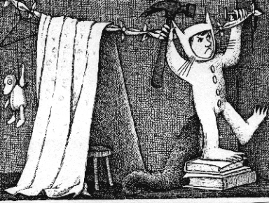 | ||||
| Maurice Sendak |

I'm having so many problems with this technology, I am wasting so much time with my beginner's mistakes! Here I was trying to show my finished image, plus the fact that although I can now control the size of the image in print, on paper - when it comes to what goes on the screen, how to place it, and make it in the same proportions as the original, it's the system controlling me rather than the other way at the moment. So this image should be 16.5 x 11.5 cm. I have show two here. The first one is scanned and added here. The second has been resized with photoshop elements first, and I have asked the computer to show it at that size, but look what I get (added as 'original size'). I have left it as an example of my continuing learning and battling.
A last image I want to put here this week, is an image in progress. Painted in acrylics, but I will continue in oils. It represents practice and more. I was working on resemblance. I am painting from a family picture. The one in the back is me, and this picture captures a long, long story which means a lot to me. I didn't realise how much until I started. I think I ought to dig deep and see if I can use whatever lurks in there for my own development. Here it is:
Friday 22 October 2010
flying week
Where has this week gone? When I was on the bus, the other day, I realised that I have started to look at people and things in general differently. I also used to walk and look at the pavement or something, dreaming . Now I pay attention to people and their shapes, what they wear, colours, the way they walk, the shapes of things and how the light changes them.
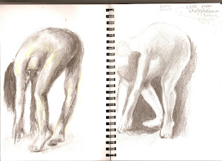
I have done some work in my sketchbook: nude poses from a book for artists who cant go to life drawing. In the first one I used charcoal. It was too big for the paper really, and I had to smooth it and use chalks to correct the light areas. The second one was in solid graphite pencil-like stick. I concentrated on the negative shapes. I had to stop before it was finished but I'm pleased with my progress.
I have also worked on more images about global warming. I did not finish also had a go at turning them in a children story. My favourite is the bear and the skinny family of famished penguins. For the one with the scientist, I looked at cartoons of scientists and adapted one so he holds ice-cream and changed his head so he looks a bit like Einstein. I think it needs re-working, that scientist is not mine yet!
Sunday 17 October 2010
17.10.2010 computer trouble week
This is my first illustration for exercise one: getting the gist of it
. After selecting words in an editorial of the New Scientist, my illustration subject was going to be about global warming. We hear scientists' views and the public's ones too, but not the animals.
This week I wasted an awful amount of time finding how to use a scan from my all in one HP scanner/printer, and resize it for printing the size I want. This is essential for when I will send scans of sketchbook to tutor, or when I do a small sketch and want to print it big. (Quentin Blake works on a light box, with a sketch under his paper, I wanted to be able to do that- and I needed the size of the sketch I made to be bigger, even if it was on many pages).
I also had made a drawing 100% bigger than I wanted for the finished product, so I could have details.
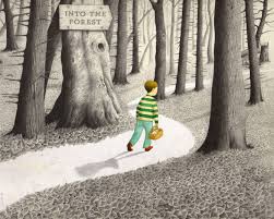 |
| Anthony Browme |
 |
| Oliver Jeffers |
 | ||||||||
| Ralph Steadman - Animal Farm | I also looked at a book from the library about an international survey of illustration for children books from 1979 (the year of the child). It is called Graphis (4th international survey of children's book illustration) Ed. Walter Herdeg, Graphis press (Zurich), 1979. |
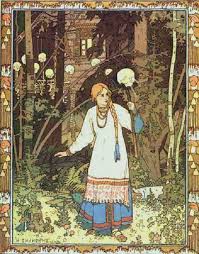 |
| Bilibin (1876-1942) Watch the decorated frames! Also did Sceneries for Opera |
Sunday 10 October 2010
Reflections on children books images
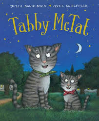
I stumbled on One more book illustrated by Axel Scheffler. and found a demonstration of him talking and painting a gruffalo http://www.guardian.co.uk/books/video/2009/jun/10/gruffalo-axel-scheffler
Ah ah! now I know how he does it! quick quick, let's order inks and pencils! I couldn't wait and had itchy fingers. Practised by doing something for my daughter:
Now I'm plagued with computer problems. I have to find out how to print something to the size I want (not a size pre-selected by the computer). I have asked just about anybody I know, and so far no luck!
10.10.10
. practised with the bamboo pens for pen and ink. Also read more online about the technique with dip pens. I am now planning to buy a few different nibs to experiment with.
. my attempt to do a picture in the style of Quentin Blake revealed new challenges: 1. I learnt that I had to simplify the image, from the first one I painted in pen and ink. Then I blew the image up and used paper over a light box (not mine). This brought up new problems: the image needs to be more interesting because of what the characters are doing, they are 'just' sitting and this is not good enough for young readers. I've worked in my sketchbook on new poses.
. started on the next exercise (getting the gist), and since I only buy the new scientist, picked an editorial from this. Now I have to do an illustration on global warming... major head scratch!
Friday 1 October 2010
1.10.10
- went to library, ordered books on illustration and K. Hale (from other libraries)
- practise on sketch book making cartoonish characters
- time management: need to sort out family/housework/work/study time
- drew timetable until assessment 1
- having difficulties with navigating OCA site and loggin on to this blog (mucho problemo)
28/9/10
- started to work on drawing in style of Quentin Blake
- I'll have to work BIGGER - found that with K. Hale's exercise too
- change faces/bodies make style looser
- check out how he colours with paints
- have ordered bamboo pens to try and draw like him
Monday 27 September 2010
Reflections
I have started my learning log on paper. Then moved to a learning log by blog. First time I'm doing this. Reasons for change: easier for assessment, comparisons/comments from other people, can post with images (++) and links. This seems easy to use, except loggin on. For some reason it takes about 10mn for me to log on. Changed password million times, and it still does not recognise it. Perhaps enter wrong mail address? still dont know for sure, but it's a pain .
Talked to tutor on phone. Asked for a Reading List, as I think I dont know enough about illustrators. I haven't sorted out my timetable yet, time management as usual not my best friend. Making images: could do with some basic kind of photoshop knowledge. need some materials (eg bamboo pens) but will received student card for discounts within 7 days, so I'm waiting.
Talked to tutor on phone. Asked for a Reading List, as I think I dont know enough about illustrators. I haven't sorted out my timetable yet, time management as usual not my best friend. Making images: could do with some basic kind of photoshop knowledge. need some materials (eg bamboo pens) but will received student card for discounts within 7 days, so I'm waiting.
My first effort in the style of Kathleen Kale
I used my teenage cat Sparkle as the model for this cover of an imaginary book. I'm still working at it, not happy with many things. Have learnt that I should have done a larger drawing. Used Gouache.
more on Kathleen Hale 'vs' Quentin Blake
Context:
K Hale started designing dust-jackets for WH Smith, and illustrated children's books. Married 1926 - bored. 1938 Started Series of children's books Orlando the Marmalade Cat (A camping holiday). Link between what goes on in her life and stories. Last one 1972 (Orlando and the water rats). OBE 1976.
Q Blake: Involved with Chelsea School of Art, Institute of education, taught RCA over 20 years - Illustration. OBE 1988
1999 Children's laureate, collaborated with Roald Dahl. Remembers drawing from young age. Made living from illustrations and cartoons (eg Punch), also exhibition curator and made public art for hospitals. He is a patron of the big draw.
I was interested to compare his personal life with Hale's to see if the amount of time they could devote to their art was comparable (families/children). All I found is that Blake never had children, in a wonderful article. Liked the article especially because it gives a sense of how blakes tries to convey an idea, how does he go about it.
guardian article
Style/Imagery:
K. Hale: colourful illustrations. Complimentary colours. Cats in human poses/actions. quirky, humorous and stylised.
Q Blake: spontaneous look. pen and watercolours. Imagery inspired from the stories he illustrates (many with children) imagination important, people, animals, contraptions. Also purpose: hospital entrance - to cheer up sick patients (alien pushing trolley) see Blake's work for hospitals
Production:
K. Hale: Pencil and watercolour sometimes with crayon (e.g. Orlando and Grace afloat, 1955 or ABicycle made for 5, 1938). For the Orlando books, many pages were hand-lithographed and that gave them a painterly look (www.charlottecory.com).
Q Blake: Fast scribbly ink lines. Pen and ink and watercolours, pens: with nibs or bamboo or quills. Gives black line a very varying thickness and expressiveness.
Blake says he likes to sketch and then use a light box (standing up!). The image below his paper is visible but not 100% clearly, so he can be fluid and spontaneous with his line. I can understand that easily as I've learnt to write with pen and ink at school. A line that is not spontaneous is not right, it just looks terrible. Lots of info on Quentin Blake Official Website.
Thursday 23 September 2010
tuesday 14.09.10
I started. The question was about how illustration has evolved over the past 50 years . This showed me how little I know, and that I should get a BOOK LIST. Also shows they are all British illustrators.Found all the information through Google, G. images, and Wikipedia. I find that information on format, support, and making technique are often lacking.
The artists to choose from were:
EDWARD BAWDEN: (1930-70). His style is very 60's. Reminded me of my childhood - fabrics, vague memory of a small printed plate. Superimposed patterns. Houses, Smithfield market. Prints. YUK. I hate it, and it would be useful to know why. Something to do with childhood memories? I think his choice of colours mostly. I wont dwell on him anymore, since I like many of the others.
KATHLEEN HALE : ( 1898-2000) Illustrator, Children's Author, also interesting as a Working Mother
! Famous for Orlando the Marmalade Cat. Bright colourful very 50's pictures - hand-lithographed. Large format books (Only found images on Google, none available locally and Bridgman Library had nothing on her). She wrote biographical A Slender Reputation. Would like to see real copies!
ERIC RAVILIOUS: (1903-1942) Painter, Designer, book illustrator, wood engraver.War artist killed on a mission. Many landscapes, use of light - dramatic. Stylised and slightly naive. My favourites are his black and white woodcut prints. See Towner art gallery in Eastbourne. Love Scenery from the train (watercolour?)
http://www.eastbourne.gov.uk/leisure/museums-galleries/towner/about-towner/collection/
EDWARD ARDIZZONE: (1900-1979) pen and wash. Humour. Children's books: Little Tim. I like the feeling of lovely little illustrations with pen and ink, or watercolours.

JOHN MINTON Painter, illustrator, theatrical designer. Not my cup of tea.Too serious!

E H SHEPARD: (1879-1976) Illustrator and contributor of cartoons (Punch). He illustrated Winnie the Pooh, and also The Wind in the willows.
I am an admirer, I love his style, fluent and catching the moment. It is so obvious that Shepard must have been sketching for a very long time. He must have been so excellent at it! Well I look up to him and keep up practising! I was reading comments about how his illustrations made Winnie the Pooh. I would agree! My children were so attracted by the illustrations that it encouraged them to read these stories. Oh and he was influenced by Sir John Tenniel (Alice in Wonderland's illustrations).

The artists to choose from were:
EDWARD BAWDEN: (1930-70). His style is very 60's. Reminded me of my childhood - fabrics, vague memory of a small printed plate. Superimposed patterns. Houses, Smithfield market. Prints. YUK. I hate it, and it would be useful to know why. Something to do with childhood memories? I think his choice of colours mostly. I wont dwell on him anymore, since I like many of the others.
KATHLEEN HALE : ( 1898-2000) Illustrator, Children's Author, also interesting as a Working Mother
! Famous for Orlando the Marmalade Cat. Bright colourful very 50's pictures - hand-lithographed. Large format books (Only found images on Google, none available locally and Bridgman Library had nothing on her). She wrote biographical A Slender Reputation. Would like to see real copies!
ERIC RAVILIOUS: (1903-1942) Painter, Designer, book illustrator, wood engraver.War artist killed on a mission. Many landscapes, use of light - dramatic. Stylised and slightly naive. My favourites are his black and white woodcut prints. See Towner art gallery in Eastbourne. Love Scenery from the train (watercolour?)
http://www.eastbourne.gov.uk/leisure/museums-galleries/towner/about-towner/collection/
EDWARD ARDIZZONE: (1900-1979) pen and wash. Humour. Children's books: Little Tim. I like the feeling of lovely little illustrations with pen and ink, or watercolours.

JOHN MINTON Painter, illustrator, theatrical designer. Not my cup of tea.Too serious!

E H SHEPARD: (1879-1976) Illustrator and contributor of cartoons (Punch). He illustrated Winnie the Pooh, and also The Wind in the willows.
I am an admirer, I love his style, fluent and catching the moment. It is so obvious that Shepard must have been sketching for a very long time. He must have been so excellent at it! Well I look up to him and keep up practising! I was reading comments about how his illustrations made Winnie the Pooh. I would agree! My children were so attracted by the illustrations that it encouraged them to read these stories. Oh and he was influenced by Sir John Tenniel (Alice in Wonderland's illustrations).

Subscribe to:
Posts (Atom)


