Search This Blog

Tuesday 18 December 2012

Exercise: travel guides

The brief is to produce three illustrations for a series of book jackets, travel guide sized, for Helsinki, Istanbul and Milan.

This is not my cup of tea! I try to be positive and try, in the past I have always learnt a lot from projects that I would have avoided.  First I searched the internet. I did look in the library where Turkey barely exists unlike New Zealand and Australia! - not to mention there is nothing at all on Finland...  so the internet is great for me. I was looking for images of "things not to miss in ..." and maps. Maps are not great. In Istanbul, there are so many things to see, very close to each other on a map that my first thoughts for a diagrammatic way to put it all together were out straight away - or are they?

http://neuroself.com/2011/05/14/human-brain-mapping/


I found something that summs up my idea of 'diagrammatic', that could be useful here (?)

http://www.austinkleon.com/2008/02/13/in-defense-of-food-an-eaters-manifesto-by-michael-pollan/


I decided then to look at what the three cities would have in common that I could show visually. Two of them are by the see, one is landlocked. I therefore concluded that the style of the covers would have to unify the guides, with an idea of a map to add the required diagrammatic element, and featuring one perhaps two images showing a place of interest. I also almost always take too much time on each project, so for myself, I wanted to do this as quickly as possible.

Helsinki mood board, I'm so proud I can do this now, so easy for someone else maybe!
In the middle of the project I realised there was a quick way of putting together a mood board that I could use on pixlr. Helsinki has its own visual problems: the Sibellius monument/sculpture looks interesting and I would love to visit it, but visually from a distance I don't like it at all. The rock church is 90% underground and very big so it looks like 'a pile of rocks' from the outside, and small pictures really don't make it justice.  I think I can use better a picture like the one of a summer house (very popular things in Helsinki ) with northern lights.  Note to myself: I copied the medieval image found on the net when I was researching helsinki, but can't remember where it came from!

Coming back to this project: I had various ideas started and abandoned. Here is one of them which is more developed:


Tuesday 11 December 2012

Editorial Illustration II

Imagine I have been commissioned by the paper to create an illustration, being a visual interpretation of
How green is your food?
I immediately thought of food that comes from the other end of the world using planes etc. and the associated air pollution.  I did find an online article that supported that idea:
http://news.bbc.co.uk/1/hi/uk/4684693.stm
However, my visual ideas came to me before I found the article, I made notes such as 'veg on a plane' or 'veg driving'. I thought I could use some recognisable vegetables as metaphors. I looked on the net for images of vehicles and made some sketches:


I liked this idea of the motorbike, and decided to work on the idea of a chicken as a hell's angel on a Harley Davidson and got straight into it. My veg (peas or beans) had arms added to make the image work, but my family criticised them and said they could be all sort of things rather than veg. My idea of a Harley rider facing the viewer, would work better with a chicken as it had 'arms and legs' already there.


Exercise: Editorial Illustration

Looking at The Guardian Magazine, I always like Tim Dowling's articles, surrounded by great little illustrations by Benoit Jacques, a Belgium illustrator:


http://static.guim.co.uk/sys-images/Guardian/Pix/pictures/2012/12/5/1354718908259/Benoit-Jacques-illustrati-008.jpg
The illustration relates to the text by providing drawn characters (pen and ink) that come back week after week. These are narrative and they follow the text of the article as family pictures would be, with added little notes that make them funny on their own - in this case one shoe off, one shoe on.


The Stephen Collins cartoon is also in the magazine:


His cartoon style allows him to extend ideas far in the imaginary world, allowing him to make a social observation. Although I quite like these cartoons, I rarely read them as they are printed quite small, so the text is very very small.


In the food and drink section, Berger and Wyse offer another cartoon:


This illustration plays on the idea that a food critique talk may start like the text in the bubbles, but the end of the scene represented shows that the man is more concerned with how to make his blog look good. It could be also a comment on people with phones in restaurants.  It is narrative, and stands out by itself. I like best the cartoonist representation of the people's clothes and current fashion sense.


In "What I'm really thinking: the novelist", there is an illustration by Lo Cole

This is using a metaphor and is rather decorative. Accentuated by a strong colour scheme, it is almost abstract and eye catching.

 
In "This column will change your life:..." By Oliver Burkeman, there is an article saying that  'Every hour spent sitting watching TV knocks almost 22 minutes off your life.'
 Illustration: ladythingamajig.co.uk  

This is my least favourite illustration in the magazine.  To me Carpe Diem refers to a music group (French Prog Rock!), but it is latin losely translated as "seize the day, trusting as little as possible in the future". OK, many Guardian readers will get it. So I can see the conceptual meaning here, and the 'decorative' aspect it has with the text. I understand sitting and watching TV shortens your life, from reading the article. I can't see why there is a goat or dog there, or is it that walking the dog is good for you?


Sunday 2 December 2012

Magazine illustration II


For this painting, I used many colours and ended up colouring the mice and mice things much less so they would stand out.  I worked on A3, much larger that I usually do. Unable to scan this image, I took a picture and will try to take a better one at a later date.
Although this was 'finished' because of the assignment is overdue, I could have worked on it more.  I wanted to add mice shadows, work on the shades of some cubes more to improve the perspective etc etc.  I also thought making another image seen from a different point of view - as seen from the floor level, and experiment with ways of closing up on the mice to be able to have more details. 

In conclusion, I really enjoyed this assignment and learnt a lot from it. I also re-discovered Richard Scarry, W. Heath Robinson, and Rube Goldberg. What a treat!


Assignment four: Magazine Illustration

I chose an illustration of the topic of "lost".  I wanted to work on the idea of a lost teddy. Armed with a teddy keyring, who looked not particularly happy, I placed it in various places in the house where it could look lost and sketched it.


Examples of sketches


Unfortunately, light pencil drawing doesn't show very well here, so I have made a small selection from many sketches.
                                                                                                                                      
 I worked a bit more on this sketch, in pen, watercolours and charcoal after the first round of pencil sketches.


I worked on the idea of making an image of a bear lost on a mountain of bricks, with  emergency rescue mice trying to help.


I remembered the images of Richard Scarry and thought my mice should do things and get into funny situations to make it more interesting for children.

I originally thought I would be able to make mice like this one, and would be able to put them in a cube landscape digitally. However, my scanner stopped working. I now decided to make an image with drawing and painting. I remembered a previous exercise where the image was too crowded with characters, so after my pencil sketch, I reduced the number of mice. Perhaps this is not sorted out yet, but it gives a good idea of what direction I would work towards ideally.

For some reason, I can't add my pictures here. I will now try to start a new page and put them there.

Monday 15 October 2012

Character development

As instructed, I have collected many characters from newspapers and magazines. (Found it not a very good source of inspiration or characters.) I went to the library to look try and find more interesting characters from different magazines and newspapers than the ones I have at home. Found that the most interesting characters were the ones reading the magazines. 
To sum up, once I finished this exercise, I discarded all the little paper characters that I had carefully cut - am I missing something? Is it that I prefer fictional characters?

I used my "unlikely gardener" character to practise something I am trying to learn about colours (gamut selection), and I'm not sure I've understood it well.  I also didn't want  her to have a realistic face. This was my attempt at giving her a naive, somewhat abstract face - unlike the portraits I'm used to.  Is it a successful image? I'm not sure!
The "unlikely gardener" on right from National Trust magazine was my favourite

I tried to visualise her in different gardening situations

One of my first attempts, the writer JK Rowling

The 360 degree drawing, very difficult to realise without a model
Because I want to get on with the course, I haven't really tried with a different character yet. I hope I will find another one to inspire me and come back to this.

Thursday 27 September 2012

Exercise: visual distortion (2)

I have lost my last digital image. As it had taken me half a day's work to make, I have decided not to make another one. It included colour adjustments and shape distortions, and I'm pleased that I managed to learn how to do this. 

Also, I started with the 'paint.net' programme because I found it the easiest to use.  Now I also use 'pixlr.com'. I think I can do more with pixlr and it maybe closer to 'photoshop'. However I should learn how to save my final work better! 

drawing from cat collage (distorted)
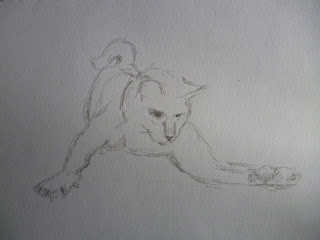
carried on working on the drawing and made a few studies of cat heads as I thought it was badly needed
this was an idea that I liked but I would have to rework the fork / cutlery like paws and finish

I accidentally made this on the computer and liked it...

This was the final digital image. 
I like the final image as it tells a story. I used a digital finish which takes me a very long time, but I like the idea that I am now able to play around with some of the different items in the image.  I aim to be able to use this more, to a point where I could make a rough image using my own ways and the computer, and be able to decide on the best medium to use to finish.

Monday 24 September 2012

Exercise: Visual distortion

At the beginning: drawing of a cat - I picked our cat Sparkle
She is a hunter, but I couldn't also sketch her in action, so for this I drew from images on the internet that most resembled her.


Here is a stylised version


From this I made a collage, and a digital collage (yes, I'm making progress in that area, but it takes so long to learn).


digital version
First digital collageSomething went wrong when I saved my last digital collage, which I had distorted.  

Friday 14 September 2012

Exercise: Tattoo - 3

Using the tattoo design I made earlier, I wanted to make a pop-up card. I used the Kyle Olmon website to practice making one that I could adapt: 

  Baby signs pop up card website

Then I adapted it to my own card:


This can be considered a 'prototype' of a would be mother's day card. It works as a pop-up card that can be folded flat and put in an envelope.  I have tried to add a message by printing, cutting and gluing unsuccessfully.  A specialist would be able to do that in a minute. My plan now is to wait for my daughter to come back from school and help me to produce an idea of what it would look like with the message. 

Phew!

Tuesday 11 September 2012

Exercise: Tattoo - Part 2

I have started by making drawings for an 'ironic' mother tattoo, and thought that I should consider better how some elements traditionally used like roses, ribbon, and style of lettering can be useful to integrate the writing in the image.
This image shows the colours  better   (warmer)

Final idea inspired from the ones below


In the image above I made a mistake while using the computer, but quite liked it. I thought it would be suitable as an ironicon the arm modern kind of tatoo a bit like the one below.
image from the Smithsonian