Search This Blog

Thursday 15 December 2011

Project: creating mock-ups

For this project, I realised that I failed to find a magazine or newspaper with a design I like. This is probably an indication that this field is not for me??

In any case, I picked an article in the New Scientist, entitled Crocodiles swam the Atlantic to reach America.  I Practised doing this in the middle of Christmas preparations, so for instance instead of looking for a fine nib and ink, I used a felt tip pen. I chose to do something rather than being stopped in my tracks by perfectionism.

My mock-up was made by measuring the space where the picture is with the crocodile, scaling it up to make it easier to draw, and fixing it together as best as I could with the computer. Not sure where the pixellation came from but I like it! It's a bit like computer style impressionism!  

It worked saved in "Gif"


Note to myself: used crocodile sketches, scanned them and printed them in different sizes. Printed-cut and glued them, then painted over it. Looking to have a lino cut (/wood block print) feel. (Not sure that in this image the statue croc. is the right size). Afterwards, looked again at the 'tears of the giraffe' book cover, and realised that there is an area around each object, like the paper cut around the design, sometimes coloured, on each and every object.

Wednesday 23 November 2011

Exercise: Client Visuals

Here I have picked a book cover. The book is ''Tears of the Giraffe'' by Alexander McCall Smith, ed. Abacus, London, 2000. The illustrator is Hannah Firmin.

This exercise is about distilling the image, until an only edited form remains, that still makes sense. Like getting to a 'visual' in a reverse process.

I was asked to make drawings 2.5 times larger than the printed size. In this case, it was 2 times larger, and to scale. (I don't work on very large sheets of paper, and this was the largest size I had to work with).

Here are 3 versions of 'visuals'

most complete version

Here everything has been simplified, but would still give an editor a reasonable idea of the subject and style of the illustration.

I think I am reaching the limit of what I could remove now, apart from some of the lines representing vegetation beneath the giraffe's feet. I don't know if it is too simple as a visual. I guess it depends how well the illustrator and the client know each other already...

 Because of the process, and use of large paper, I had to take pictures - rather than scanning - and once again, I am reminded that I must learn to take out the date stamp that my camera puts on everything!

Wednesday 16 November 2011

Exercise: Viewpoint

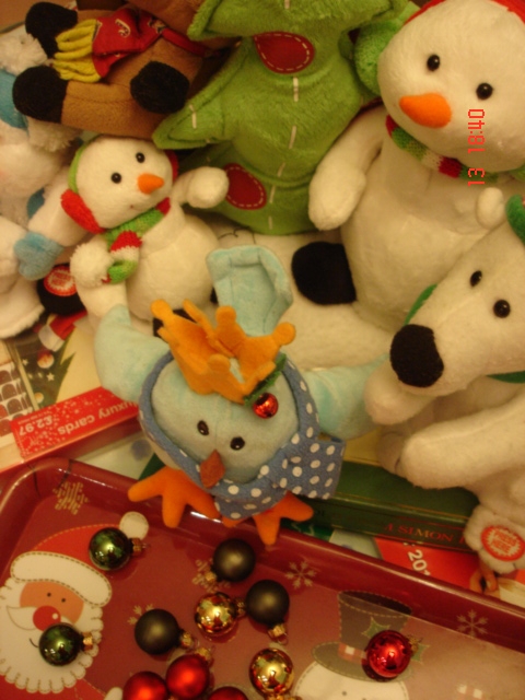
I chose the theme of festival: christmas and made a set of objects accordingly.

I documented them with pictures, trying to experiment with different viewpoints:


The next step was to make thumbnail drawings, again exploring different angles and 'zooming in and out'. I also used different drawing materials, as I still need to decide which ones are my favourite.

 black conte squares
biro
rolling ball point pen
markers and coloured pencils


For the drawings, I made view finders out of cardboardAlthough I did find it easier as I went along, I couldn't get a variety of angles as I did with the camera.
I had placed all the objects on a table, so I could easily view them from below. 
I am glad that I used different drawing mediums. When I scanned them, I had to adjust the picture, and even then the image drawn in pencil (7b) doesn't reproduce very well. I was happily surprised by the overall effect given by the conte drawing. Its size was the longest of all these, and being condensed as viewed here, it looks better. These are some things I also have to think about!


I can't draw very fast and it would have been a strain on my back to attempt to draw from above more than I did, so I am pleased that I have these views available through pictures - they are some of my favourites. 

Here are the viewpoints that I like best for this theme:


 I like the diagonals created by the arms that seem to point towards the robin and xmas bobbles -  there is too much happening for a simple image, and the robin is at an angle that may make sense in a photograph, but may not in an art work.

I like this close-up on the robin, the other christmas creatures seem to cheer him. Colours are 'christmassy' , there is a clear focus. I have decided to work from this one. 


This drawing is proportionate to the photograph, I saw it as a visual for a Christmas card, which explains why I have added bobbles and the outline of a second tree in the background.  I fancy adding colours now.
Of the different formats used, I found that the circular and the photo formats seemed to work best. Changing viewpoints made me realise that there are always more options that I first though of. 

Views from above didn't particularly work this time, but I will not exclude trying it for other projects.Here I wanted the focus to be on soft toys, and because of their nature, they were not readily identifiable in views from the top or others like close ups. Should I have picked different objects, like another student did (Rob picked bottles)  in his learning blog, it could have worked. I must keep an open mind.


Above is the Christmas card I made from the line drawing. I posted it on About.com Painting, and here is the comment I received:

Marion Boddy-Evans, Painting Guide, says:

I think if every object had a black outline, the overall feel would change, perhaps becoming more rigid. I like the mixture, of the main characters having an outline and their props not. It helps pull the eye into the focal point.

The composition works well for me to, with parts cropped off so the scene continues in the viewer's mind. Rich, layered colors that keep you looking, with the white of the polar bear giving an area for the eye to rest as well as increasing the glow of the colors by contrast.


Tuesday 1 November 2011

Diagrammatic illustration - Giving instructions

I looked at the internet for instructions on how to make a cup of tea. Here are some of my findings:
Making tea: anime girl
giving instructions, for primary schools
taking out tea bag with spoon

After receiving comments from my tutor, I decided to work from cartoony sketches in my sketchbook, as if I was telling how to make a cup of tea with a "Mother" character. 

I made the sketches in the wrong order, and sometimes added the text later, on the computer. My drawings got better, but on reflections the 'Mother' character doesn't always look the same. I also used different pens (felt tips fine liners or dip pens).

On reflection, I have learnt that it was good to follow my tutor's advice, especially the fact that I shouldn't forget that the process should be enjoyable. on occasions I got stuck, as my drawing of objects in different positions (like a pouring kettle or bottle of milk) was not too good. I resorted in using photocopying of my sketch of the object in the standing position, in different sizes, cutting and gluing. I found that so much fun, that I am sure I will use it again, exploring visual posibilities further...


I realised that I had considered the order in which the images will be 'read' by the viewer, but not how the elements would fit together. Ideally, I should have considered if there were going to be pages, and make them consistent. There may be a software available to help with this?


Following my previous 'making a cup of tea' illustration, I also wanted to make a simple one, on one page, without text. I used colour to enhance some of the features:


Monday 17 October 2011

Exercise: Abstract illustration

I listened to "Summertime" by Miles Davis


http://www.youtube.com/watch?v=N090STPx-2M


The first time I listened to this music, I was struck by the tone of the trumpet which I found incredibly screetchy. On subsequent listening sessions, this was less the case, because I passed the initial shock and other sounds made it more subtle.  Nevertheless, I decided to try and communicate it visually.


Here I created marks while listening to the music, on the top of the page.

And then I forgot the paper by the computer,  my son came along and added his own doodles underneath. (Ironically, none of his characters have ears!)

I was interested by the way a change in colour, brought focus to the blue claw he drew.
I selected this section

Removed  some aspects of the image

Removed the background
At this point I realised that I loved the result, but would like to learn how to change the colour of the element which symbolises screetchy the best, and play around with the image a bit more with textures and colours as I was asked. 


example of an attempt that I find not successful
My best coloured version of "Screetchy"I quite like this last version of my image for this exercise. The colours match an underwater feeling I experienced whilst listening to the music, and the screetchy sound that came out from the trumpet (perhaps like arc welding?)
I also chose colours that do not particularly go well together, to give a sense of uneasiness.  I am new to computer generated images and find it sometimes gives me surprising results that I couldn't have dreamt of, or perhaps realised with other media. 

Do I think any of these could be an album cover?  I don't think green is very popular, and can't imagine seeing the green version used for this purpose. The white version could be used, probably with text in contrasting colour like red. Yes, I can see this one as an album/cd cover.

Monday 10 October 2011

Exercise: image development

I have picked an image from this site:
 http://childrens-entertainer-uk.co.uk/childrensfunparties.php?act=Workshops%20-%20interactive

I chose this picture because of its range between foreground and background, and association with children and circus.

There is a meaning to this picture, which is in the look the man in the background gives to the child in the foreground. Some of the children are looking in the same direction. If I play with this, the meaning of the edited image can be entirely different.

Using the computer, I have created edited versions of this image. Adding a word on each version may extend the narrative in a complimentary, slightly different or contradicting way: 


This is the image I chose as a basis for my illustration.  I had to draw up my artwork to make a poster, add colours and textures to emphasise my message.

Once I had drawn my artwork, I did it again with the word as part of it. I am not very good at colouring in, so I used the computer. This is how I haven't played with the textures as much as I would have liked, because I don't know how and decided that on this occasion I would prefer to move on rather than spending days learning how to do this...


My poster


Following this project, I went and checked the original pictures against drawings of facial expressions for artists, as I was not very happy. I printed the pics and glued them in my sketchbook with notes written on them, and added sketches with notes that I took from the book: "the artist's complete guide to facial expression" by Gary Faigin (Watson-Guptill Publications).  
I realised that the kids were not 'shouting' as such, but more 'laughing' or 'screeming with delight'. This misunderstanding of the image I used in the first place led to what I see as a poster that is a bit weird. Most children that have seen it have commented on the child in the yellow teeshirt that they saw as being fat. 


Thursday 6 October 2011

Exercise: Reading an image

We had to look carefully at this image:


Mark Oliver

What is the image about? What is it saying?

.  a story with two kids, characters: a girl and a boy dressed like avatars in games, or like adventurers/pirates in children stories
a dragon red and asleep - protecting a treasure: throne, gold coins, a chalice
.  heat seems to radiate from dragon
.  'dumped' weapons near dragon --> defeated previous warriors attempting to take the treasure from the dragon
.  girl has a torch in her hand ( => dragon is in a cave) and points to dragon with other hand.
.      boy: crouching posture, mouth open => scared, seems to point away from dragon "Let's get out of here!"

Identify the story: 
This image is from

Tom's Clockwork Dragon 

by

Jonathan Emmett
and Mark Oliver


Tuesday 27 September 2011

Exercise: Illustrating visual space

Using the internet, I selected images as visual references. I had to chose a tree, a child running or walking, a building.

These images have been printed in different sizes and cut. 


Here there is one of each element.

The tree and house seem to be floating and the boy seems to be running.
The elements are dissociated, and it is difficult to read a narrative.

The elements seem completely horizontal and vertical in relation to the frame and the whole thing seems a bit static.

Other examples with only 3 elements are more dynamic due to elements partly in the frame, and changed in size
focus on the boy - No 1*
more threatening atmosphere, boys seems to run away from the house


The addition of a horizon line anchors the tree and gives a familiar landscape feel to the image, with some depth. Now there could be a possible story to imagine.


My use of the computer is still sketchy. Above the horizon line accidentally created a waterfall.
Here I placed it higher and it does not work.


This image is more successful: the boy seems vulnerable next to a huge tree. He seems to run away from a house in a forest. The fabric background unites the elements. This image is also dynamic as the elements are not parallel to the frame - No 3*.

Below: a bigger field (repetition of trees) makes the figure look more lonesome as in the cropped version. Again, I notice that the version with the boy coming out of the frame looks more dynamic.


Boy and dog:
diagonal => action,
horizontal = quieter walk, more sedate, less adventure, the house  seems more important.


Using repetition and diagonals: panic? Exodus? Last day of school? Difference in sizes adds depth


No 2*
:


Repetition as a pattern  ends up looking like wallpaper or pyjamas fabric

In these two I was trying to make it like a dream/film where kids fly.  They look like they are taking off in the first one, and landing in the second, because of  the direction of the body and the way we read I suppose.


* My favourite combinations, in order are No 2, No 1 and No 3.
They are all dynamic and could tell a story, and the focus is on a boy or boys. I really like working with characters rather than objects or buildings. I also favour the picture showing identical children running towards the viewer for its quirkiness.