Search This Blog

Tuesday 27 September 2011

Exercise: Illustrating visual space

Using the internet, I selected images as visual references. I had to chose a tree, a child running or walking, a building.

These images have been printed in different sizes and cut. 


Here there is one of each element.

The tree and house seem to be floating and the boy seems to be running.
The elements are dissociated, and it is difficult to read a narrative.

The elements seem completely horizontal and vertical in relation to the frame and the whole thing seems a bit static.

Other examples with only 3 elements are more dynamic due to elements partly in the frame, and changed in size
focus on the boy - No 1*
more threatening atmosphere, boys seems to run away from the house


The addition of a horizon line anchors the tree and gives a familiar landscape feel to the image, with some depth. Now there could be a possible story to imagine.


My use of the computer is still sketchy. Above the horizon line accidentally created a waterfall.
Here I placed it higher and it does not work.


This image is more successful: the boy seems vulnerable next to a huge tree. He seems to run away from a house in a forest. The fabric background unites the elements. This image is also dynamic as the elements are not parallel to the frame - No 3*.

Below: a bigger field (repetition of trees) makes the figure look more lonesome as in the cropped version. Again, I notice that the version with the boy coming out of the frame looks more dynamic.


Boy and dog:
diagonal => action,
horizontal = quieter walk, more sedate, less adventure, the house  seems more important.


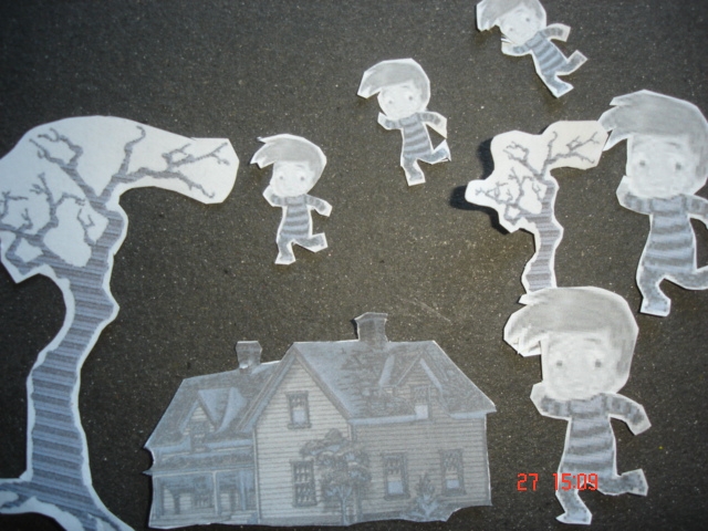
Using repetition and diagonals: panic? Exodus? Last day of school? Difference in sizes adds depth


No 2*
:


Repetition as a pattern  ends up looking like wallpaper or pyjamas fabric

In these two I was trying to make it like a dream/film where kids fly.  They look like they are taking off in the first one, and landing in the second, because of  the direction of the body and the way we read I suppose.


* My favourite combinations, in order are No 2, No 1 and No 3.
They are all dynamic and could tell a story, and the focus is on a boy or boys. I really like working with characters rather than objects or buildings. I also favour the picture showing identical children running towards the viewer for its quirkiness.

Friday 23 September 2011

Point of Sale Display #3

Here is my Autumn image for this assignment: 


To make this image, I painted a portrait from two pictures: one had Leo with a smiley face, and a pumpkin on his head, but it was not so clear that it was a pumpkin. One the other picture, the face wasn't right, but the pumpkin looked perfect. So I used paint.net and mixed the two pictures. I chose to paint it like the other pictures in the same series.

I realised that I had picked an image that did not go very well with the square format needed and decided to crop this image to see if I could get nearer to my ideal image. Here is the finished image:


Leo with pumpkin


It took me very long to assemble the scanned background, and the painting on the computer. I have learnt these skills very recently and mostly because of the finished product I wanted. 

I was very pleased with the finished image, except that it is obvious that I need to improve my 'photoshoping' technique. I have heard of the term 'feathering' and if I have time, will investigate to see if it is what I need here to improve on the merging of the two pictures.
On reflection, I am pleased with the progress I have made in this area. Other things I have to think about if I did something else like this: 

.   think of the format first - the pose (or position) of the subject and how it is going to fit that frame.

.   think of my skills and the time available. Learning something new takes a  long time, maybe well spent but  in the long run I must be able to finish within deadlines (either for a 'client' or for my course).
        I have one un-finished painting.
.   always have the final image in mind. Many of my initial pictures were not suitable - children making terrible  faces. Something else cropped up: I had given children a selection of fruits, that they picked themselves.Perhaps I should have been more in control of this too, like a film director!  

And finally, I am finally getting to grips with the presentation of my blog. It may not be perfect, but I am happier with it, and having less and less problems with it.


Thursday 15 September 2011

Point of sale display #2

Here are other illustrations for this project:
the photo
my painting (oil) 
Summer - Josie with cherries


I like my finished image. I also think that there are some digital software techniques that I probably don't know and could improve the image.  Despite this, I imagine that if the brief came from a client, this may not be what they are looking for exactly.  The fact that the images use oil paintings may be associated with quality.

Wednesday 14 September 2011

Point of Sale Display

The Brief:                                                                                                                                                     
To create images which will be used within a campaign for a supermarket, to package and promote a range of   seasonal foods.                                                                                                                                               
The supermarket is respected for the quality of food they supply.  They want to promote this notion of quality in their design and packaging.                                                                                                                              
The finished images will be a 'point of sale' display sited in a store near to the fruit and vegetables.  The final reproduction size will be 12 x 12 inches (30.5 cm). Your artwork can be same size or in scale.                         
What to do:
Create an illustration of fruit or vegetables.  One illustration for each of the ranges: Summer Autumn.

I had no problem thinking of summer fruits:

Tomatoes
Gouache and watercolours 


Strawberries

Gouache and watercolours


Grapes

Pen, watercolours and gouache


 I found the grapes more difficult to paint, and the strawberries the least - despite the fact that my son accidentally knocked the display of strawberries I was painting. Is it because I find them more tasty? 

Then I was thinking about autumn fruits, are these apples and pears? berries? I saw some ripe blackberries in June, seasons are shifting..., my greengrocer didn't know (!), he said we can get fruits all the time...


It was at that time that I was really going back to working on my course like I should, and I wanted to enjoy it rather than being bothered by shifting seasons...
so I decided to follow my ideas, after all my illustrations were going to 'be me' and if they were not exactly what the brief asked for, I would see to that later...

So I took thought about it. 
Here is what I decided to to:
I took pictures of children with fruits (in the end I gave them the camera and they took the pictures themselves). 
Then I chose the ones I wanted,and used them to paint portraits with fruits.

Andy with tomato eyes


Following this, I made a mood board for summer and used this to paint colours for a background.

Autumn mood board

Summer mood board

Finally I used the background to put together and finish my whole image digitally. This was exhausting as my skills with the computer are at the beginners stage (which shows when one looks at the unwanted line at the top which could have been avoided) but I'm determined to move on and keep learning. 


Summer (Andy with tomato eyes)

Visual metaphors #3

Other cartoons on "reaching retirement":


Bert used to be a park keeper, but now he enjoys his retirement


For her retirement, Mavis had asked for a bike

Bert went wild at Carmen's retirement party
                                      
When Mike's retirement came along, he discovered he could no longer get on a table, never mind dance on it!


Friday 9 September 2011

visual metaphors #2


*Censorship of the press 
 

* Economic catastrophe: 


"Choose one of the phrases and create adrawn visual list of objects and subjects which could be used to symboline them... show your drawings to someone else to check their understanding of the meanings in your drawings and judge how far your drawings communicate what you intended" 

I chose "Reaching retirement" and with my first effort I learnt a lot:

I started with a sketch but got carried away in a kind of greeting card style. Here are comments I received and my response:

(Person 1):
 It's a very cheerful scene until you realise that person retiring is a skeleton. 
I think people retiring are looking forward to many relaxing years.  This illustration made me think that retirement is the step before death.  So I'd say it's not really suitable.

(MP):
I was trying to make a political statement with my drawing (...)
You're the second person who made a comment that made me realise the sort of 'greeting card' format I had chosen is not working. I'll try and see if it works as a cartoon, maybe it won't work at all?

(Person 2):
I think it's a bit too sinister for a retirement card, with an overall sense of death about it and secrets behind the big smile. I find myself wondering if that's Death on the left giving a present to the woman on the right or if she's giving it to the skeleton and has some hidden secret hence her overlarge grin?

Perhaps someone who's really really old only now getting a retirement party to convey the sense of retirement age being shifted later and later? e.g. "when X's retirement party came along he discovered he could no longer get on a table never mind dance on it?" type of thing. 

My New (revised) drawing:

By the time Bert retired, he showed signs of ageing...