Search This Blog

Friday 30 March 2012

Exercise: Museum posters

My local museum is the Brent Museum, now located in the Willesden Library building. This building is due to be demolished and a new one built, if Brent Council's plans go ahead. This may explain that I found odd displays like a black doll which had fallen on its front, with its head next to the body. There are also interesting graffiti here and there...  I had a good laugh and took plenty of photographs.  

My scanner/printer is having problems at the moment, so I made charts towards my three posters by age group like this: I wrote the subjects of my photos on paper, cut it in strips and glued the selected ones on each chart.  That helped me come up with ideas suitable for each age, and a common theme for all three.  This museum has the ability to make me laugh every time I have visited it, so the common theme is "I love Brent Museum" and I vowed that my posters should reflect the funny side.

Child 5-9  :   I      Brent Museum
Teen: Roflmao at Brent Museum
 Adult: Brent Museum engages the community (?)

Initial ideas
Idea for the teenage poster that I wanted to picture in Manga style
Manga practice (pencil, pen and inks)

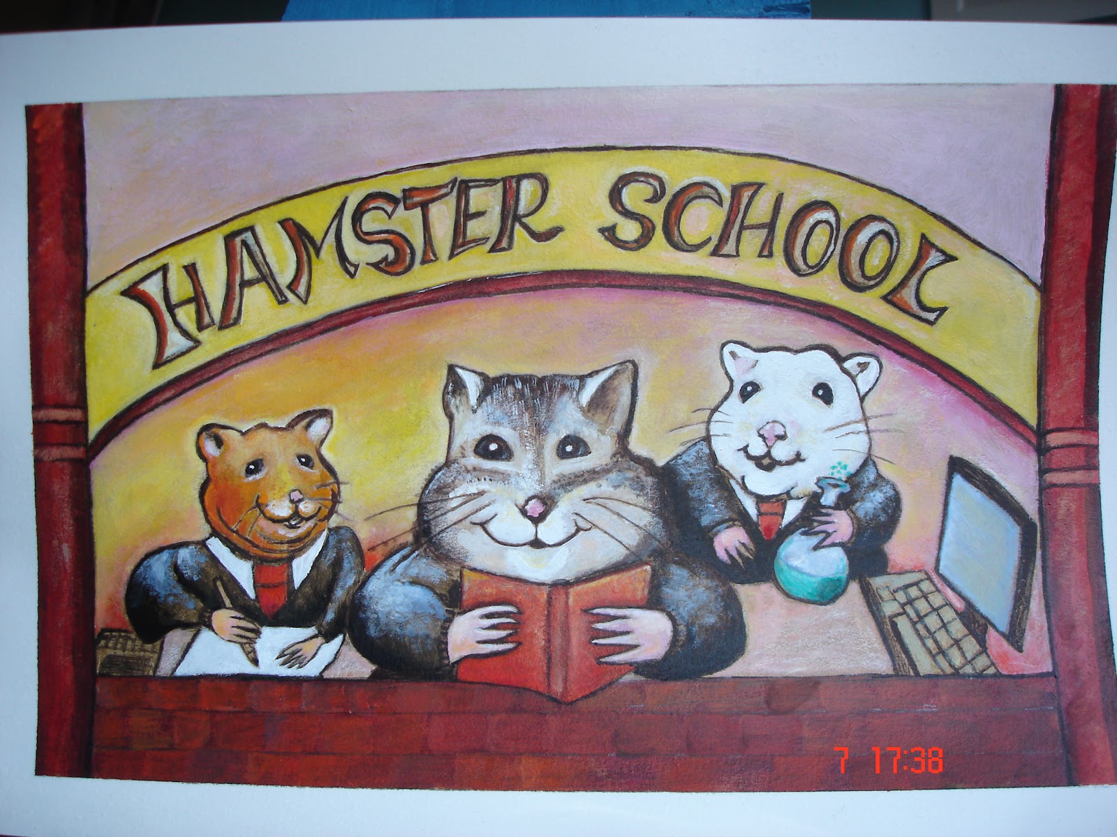
Poster for younger children (includes toys etc. from museum)

Exercise: Identifying tools and materials (2)

While my scanner is out of action, I have taken a picture of the two things I have painted influenced by the style and techniques/materials used by Will Terry:

The first one is the most successful. I have chosen to change the point of view of the subject from the initial drawing, to bring the frame closer
Painted in acrylics on paper


the original
These are the kind of colours I had planned to use

 I think it works well because the three characters are the focus, and like the three bears, they have different sizes.
I have tried to plan the writing so it is an integral part of the image, but I was still not sure about it. After asking other people their opinion, I am fairly satisfied that the lettering is ok, but many of them thought that the main hamster was a cat! I can see their point too, next time I'll have to remind myself to check not only the style and the viewpoint but also what I am drawing!!

For the next picture, I started with this image
I then decided to change the boy, to one that came from the Jazz poster. I also added sidekicks to add to the story:
At one point I realised that the picture wasn't working and I stopped painting.  I asked for advice about it from the illustrator Dave McAllister. He explained to me that I used too many elements of the same size (cats etc), and advised me to do it again. We also talked about the space in the image that I have 'filled' with creatures and flowers... and compared it to the style of Will Terry.  Will Terry keeps it interesting by suggesting clouds, vegetation etc and in his images that inspired me,  he uses the composition so there is little space like this
.
At this point, I have left it and may come back to try again later.